
Hi there! Can you tell us a little bit about yourself and how you got started?
Hello, I am redmanAKA. I didn’t get into art college but I did get into a FÁS screen-printing course. When I was sent out for work experience I pretended I was a graphic student and got a job in a sign-writing/screen-printing company, in their art department, working mostly on artwork set-up, with a few design tasks. It was fun for a while. Then my brother (who had started a small graphic design business on his own) asked me to help him out and I agreed to — if he bought me a motorbike. He did, and that was the start of Paintbox. We are both self-taught, so we learned mostly by trial and error. I was really into music — mod/soul stuff, and labels like Mo’ Wax, Talkin’ Loud, etc. — and started designing flyers in 1992 for friends’ clubs with people like Johnny Moy, Billy Scurry, Claire Maloney and so on. Much of the work was influenced by what was happening in club culture in London at the time, and things really started from that point. I left Paintbox to work on my own in 2000, focusing mainly on music and entertainment work, avoiding advertising agencies and corporate work as much as I could. And that’s what’s been going on ever since.
Talk us through your favourite cover artwork you created.
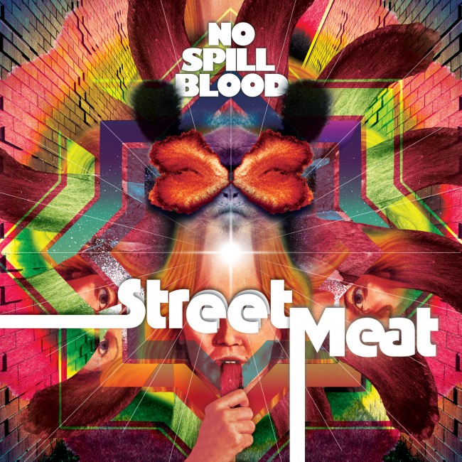
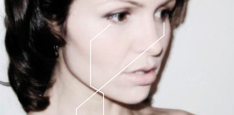
We Love You Dark Matter by Dark Room Notes (DRN). I was in a band with the drummer, Darragh Shanahan, and he had joined DRN. They were essentially a rock/pop outfit with a synth aspect/background, and they had no visual representation up to that point really, so they contacted me. The music reminded me of some of the more underground synth-based bands from the Eighties, but they had a modern feel, so myself and Darragh spoke a lot about the visual style of bands like New Order, Roxy Music, early Cure and such like. We had originally done a sleeve which Darragh had taken the cover shot for, but it was furiously rejected based on what was thought to be inappropriate nudity. (It’s harder than you think to get an ass onto a record sleeve!) It was a really beautiful sleeve, but it was also a democracy, so we spoke some more.
During this time the band had a big fan in Canada who used to write regularly. When Darragh showed me her notes on Facebook, I thought her profile picture was great, and I thought it’d be a good idea to use it, coupled with the fact she was an avid fan, which was charming in itself. We wrote to her with our thoughts and she agreed. We got the picture — a really low-res JPEG which I thought was great — and this really inspired the graphics of the sleeve. There was something special about the picture: it had an almost Roxy Music sensibility about it, and also shades of Juergen Teller. It just seemed to fit and it came about so easily. I always think that, with these kind of circumstances, it’s best to just let them unfold and see what happens. It almost designs itself. Although the picture was perfect, I felt the cover should look modern and a little ‘harder’ graphic-wise, so the bright yellow and the digital ‘construction’ lines came into play. I liked the idea of the sleeve being very clean around the front photograph, as it kind of suited the ‘digital/regimented’ aspect of their music.
This album was then re-released when the band signed to a German label, and the record company thought the sleeve was too ‘posh’, which was bizarre. So we started all over again. That was less smooth as a process, but I was really happy with that sleeve too, thankfully.
What materials did you use?
A low-res JPEG. Everything was created on computer; the band profile shots were taken by the band’s drummer, Darragh Shanahan.
Can you describe the process?
Once I spoke to Darragh about the photo and the music references for the graphics, they were happy to let me draw up some ideas. We all felt the final draft was the best so that part was pretty straightforward. As far as I remember, the sleeve was printed in Berlin.
What inspired the artwork for this particular record?
The photo really inspired the sleeve, and obviously that added to the band’s unique vibe.
Do you feel your cover relates to the music?
I’d like to think so, yes.
Did the band have any input into your work?
Darragh did all the band portraits and proofreading.
Who are your favourite artists and your biggest influences?
Thin Lizzy, The Jam, The Kinks, David Bowie, Roy Lichtenstein, Andy Warhol, The Smiths, Truman Capote, Cormac McCarthy, Edmund White, Larry Clarke, Chuck Palahniuk, Butt Magazine, James Baldwin, Huey Newton, Queens of the Stone Age, The Specials, Sixties’ skinheads, Brutus Shirts, John Reddy . . . There are so many great artists, and I’m easily influenced, so the list could be endless, really.
Are there any album covers you’d love to recreate in your own style?
Not really. I have favourite albums where the sleeves are not that inspiring but it’s part of what they are. I don’t like to meddle with the magic, or to cry over spilt milk.
Any highlights so far in terms of your work?
It’s always nice to get a job where everyone is satisfied, where it’s printed well and there are no errors. This is a constant highlight for me. More often than not, if there is a connection with the client, whether that be with influences or perspectives, the exchange in terms of ideas etc. can be very exciting. I guess working with friends can be the most fun — and the most challenging.
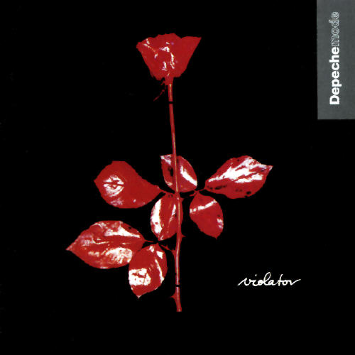
What’s your personal favourite album cover?
Perhaps Violator by Depeche Mode, or The Specials’ eponymous debut.
Are there any bands/artists you’d like to create art for?
I’d like to work with Queens of the Stone Age or Chuck Palahniuk.
What are you currently working on?
I’m working on a triple vinyl limited edition sleeve for Gavin Friday’s Catholic album; a website for Veda Beaux Reves; and some stuff for Belong To Youth Services.
Have you ever run into any difficulty or disagreement with any of the bands you worked for?
Yes, but often it’s part of getting to the solution. It’s never come to violence — although I did consider it with one band!
You can check out the rest of Pete’s work at www.thisareredmanaka.com


—