

Hi Darragh! Can you tell us a little bit about yourself and how you got started?
My name is Darragh Nolan, I studied Visual Communications in NCAD. I’ve always leaned towards the music side of things regardless of the medium I guess. I’m an artist (musically) myself so I guess it helps to be able to see an album cover from both sides, to be able to put myself in the shoes of the artist I’m creating for and wonder ‘what would fit?’. I’ve just naturally evolved into this area I think through knowing lots of musicians and the kind of things I post on Instagram, which have been described to as ‘artwork without the music’.
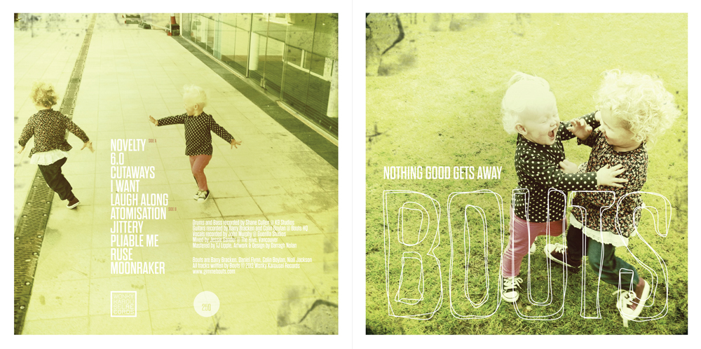
Talk us through the Bouts album cover.
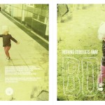
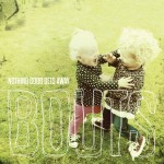
Hmm, the main idea was to somehow recreate the vibes of the music in the artwork. The guys explained to me what they were looking for as ‘having someone in a moment of true emotion’ and sent me early mixes of the tracks so I could understand where they were coming from and hopefully match the vibe. I sent them a bunch of shots and they picked the one of the two kids fighting/playing, which is a picture of my kid and my sisters kid playing in the grass outside Imaginosity in Dublin. I’ve always loved this shot myself, it’s one of those rare moments when you’ve really captured the emotion of the moment. It was taken on my phone using Hipstamatic, I took about 70 or 80 shots of the two of them playing and it’s always worth it when you get that one shot… The picture on the back cover is from the same series and just happened to match the front cover. Type-wise the guys also knew pretty much what they wanted and explained they wanted something strong and bold. The typeface is: Dharma Gothic E, I found it on Font Spring and just felt it was right for what they were looking for.
What materials did you use to create it?
iPhone, Adobe Photoshop, Adobe Illustrator…
Can you describe the process?
Well once we’d all agreed on the front shot I started working with the type. Even though I felt the typeface was perfect no matter where I placed it it never seemed strong enough or in your face enough for the guys’ semi-punk-indie (!) aesthetic. I brought it into Adobe Illustrator and drew around the word “BOUTS’ a couple of times and imported it back into Photoshop as a smart object and experimented with placements until landing on the type over the two kids. The scribbly type just seemed to really fit the music somehow. From there on in the negative space in each image pretty much informed the type layouts. I’m a big fan of invisible grids when it comes to laying out elements and you can probably see that in the results.
What inspired the artwork for this particular record?
The music, the direction, the vibes…
Do you feel your cover relates to the music?
I do, I think it conveys everything the guys wanted to achieve with the sound translated into visual form. As far as I know they feel the same… (they seem happy?)
Did the band have any input into your work?
Yes, quite a bit in so far as wanting emotion to be conveyed in the front image, wanting it to be people rather than something that’s just pretty and wanting the type to also reflect the music. It’s the kind of direction which is quite useful when you’re designing an album cover because ultimately it’s the band’s baby so you want to be sure that where you’re going is where they want you to go.
Who are your favourite artists and your biggest influences?
My favorite artists would be those that have created their own unique visual aesthetic, my favorites from any era would be Vaughan Oliver, Stanley Donwood and Leif Podhajsky. Maybe they’re obvious choices but they speak to me.
Are there any album covers you’d love to recreate in your own style?
I’m not sure I could recreate any album covers to be honest, I don’t see them as something that can be ‘covered’ like a cover version in that they are what they are and I don’t see them as something that can change or evolve. It could be just the way I’m looking at them though, maybe a ‘remix’ would be a more appropriate term for working with. Actually now that I think about it, it would be amazing to take some of Vaughan Oliver’s work (like Pixies, Doolittle) and recreate it in a style that would be considered contemporary. That’s the thing though about great artwork, it doesn’t necessarily sit in a time and place. Great artwork is just that regardless of when it was created.
Any highlights so far in terms of your work?
I was very happy with the album artwork for Deaf Joe’s album Burrowings, which I also inadvertently named one day when discussing with Joe what direction the art was gonna go in. After being given a direction I went off with a borrowed Canon 5D into the woods in Courtown and took a large amount of shots, which were stitched together into one giant panorama, I think there were 60-70 full resolution shots went into the image then cropped out areas of that one shot to create the various images used (The album and lyric sheets were both 6 panel foldouts). When I sent the proposed cover to Joe he got back saying that he had written all the lyrics for the album while out walking in the woods and he loved the images. I think a lot of the time the music informs the direction and if you have the luxury of the finished album when creating the artwork all the better, the answer is in the music. The Hush War Cry handmade foldout packaging was another favorite, there were only 50 of them made though…
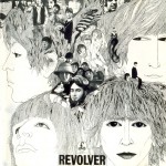
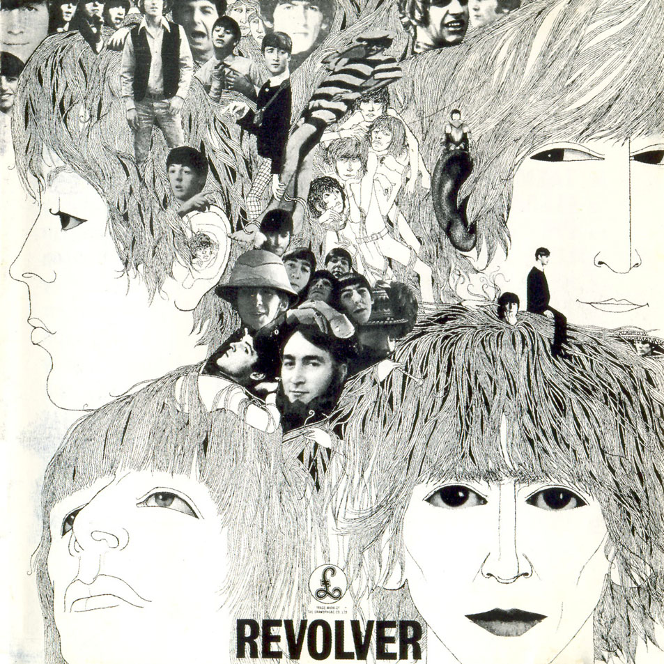
What’s your personal favourite album cover?
I think it would have the be The Beatles, Revolver. It’s just so iconic at this point it immediately stands out to me as being a great piece of artwork. Obviously my emotional attachment to the album informs how I perceive the cover. That’s the thing about album artwork though, it’s often hard to separate the art from the music and if the music speaks to you then the artwork usually does as well. I was chatting to Steve Averill once about this and he said something that has stuck with me since. He said ‘A classic album cover is a cover of a classic album’. So there it is…
Are there any bands/artists you’d like to create art for?
To be honest I haven’t ever really gone out looking for this kind of work, it has just happened organically somehow and I see it continuing in this vein in the future, working with musicians I admire and respect.
What are you currently working on?
EP/Album covers for A Lazarus Soul, Adultrock, Elaine Mai, Carnival Moon and Sacred Animals and the album/website for Deaf Joe’s new album – which is incredible by the way.
If you’re interested in working with Darragh, you can contact him here: sacredanimals@gmail.com