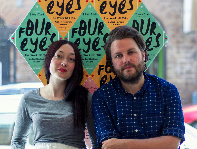
In this special installment of Under Cover, Loreana Rushe chats to Matthew Bolger and Emelie Lidström AKA M&E on the eve of their first exhibition about their stunning artwork and how they create it. ‘Four Eyes’ is currently exhibiting in Malmo and our photographer Ian Pearce was there to capture all the fun on the launch night.
Hi Guys! Can you tell us a little bit about yourselves?
We are an Irish/Swedish creative duo who inhabit a place between art and design.
How long have you been working together?
The first record cover we worked on together was Jape’s first album Cosmosphere, which was released in 2003, so we’ve been working together for almost ten years. Before moving to Sweden in 2008, we both had other side jobs but since moving here we’ve been working full-time as M&E.
What specific tasks are unique to each of you?
We exchange pretty much all of the tasks, except for the photography which is mainly shot by Emelie. The illustration and typography is created by either one of us depending on the project and sometimes by both. The idea development and art direction is always done by the two of us as it would be a waste of a set of eyes and brain if we were not both involved.
What do you feel are your strongest attributes as a team?
We care very much about our work and work very hard to produce material that not only means something to the client but also to ourselves. We have to be proud of something before we show it to the world. We also put a lot of research into a project before sketching ideas. This really helps to get to the core of what the client wants to project.
What are your favourite materials to work with?
Our favorite material would probably be black indian ink and wood. Of course the computer is the most vital piece of equipment but we really love to work with our hands and create material which has a human touch.
What are both your biggest influences and inspirations?
We draw inspiration from everywhere. Music, art, nature, fashion, food, old signage, book covers, anything we haven’t seen before. Work created by people trying to do something different.
What is your favourite album cover that you’ve created?
Matt: TRM’s Friendship would be mine, it all fits together so well I think and has aged very nicely.
Emelie: I will always have a soft spot for Jape’s I Was A Man cover. I feel that it encapsulates the spirit of what we do and the themes we like to work with.
You’ve worked very closely with Jape and The Redneck Manifesto. Discuss.
These are the two bands we’ve produced most material for over the last ten years. We’ve developed as designers in parallel to how the band has developed as musicians.
Matt, how do you find designing artwork for your own band and close friends?
I learnt everything I know about designing from making record covers and flyers for my own bands when I was in my early twenties. It was more of an education for me then my four years in college. Also being a member of the band your doing the record cover for is great as you have an even greater insight into the music. And it is this closeness that we try to achieve when working for bands we’re not members of.
How much input do the other band members have?
As much as possible. We try to get everyone involved although the members of these bands do have a lot of trust in us as we’ve worked together for so long.
Your recent work for Tieranniesaur’s DIYSCO is very interesting. Can you tell us how the idea came about and how it was put together?
Tieranniesaur sent us some images of old signage which we used as inspiration. They are also such a party band that we wanted the cover to be a as bright and full of life as possible. We wanted to build a sign for a disco or underground club from the 1920’s,with a handmade, DIY look.
What are you guys currently working on?
We’re working on The Dublin Guitar Quartet’s new album, an image for a play by Fiona Sheil which will be part of the Fringe Festival, and three or four other album covers. The exhibition is also taking up a lot of our time as it is developing all the time.
Are there any bands you would love to design for?
Yes! Slayer, Ariel Pink, Robyn and The Knife.
What are your favourite album covers?
Matt: I love the Panda Bear cover for Person Pitch.
Emelie: Noo! I was going to say that one! I also like Yoko Ono’s Season Of Glass.
If you each could pick one piece of art you have created overall as your favourite what would it be?
Matt: I’d have to say the power drill camera mount we used for Snake & Jet’s Amazing Bullit Band’s Black Egg video. It’s such a beautiful piece of machinery in itself and took us so long to build.
Emelie: I love the DIYSCO sign because it’s so tangible. Also, I’m very proud of the new mask portraits we created for this show. They are built from magazine cutouts and photographed, yet at a large size they look so solid and a bit scary.
How you do feel living/working in Sweden compares to working in Ireland?
We work in our own world most of the time so it doesn’t really matter what country we’re in so much. We really like living in Sweden but miss Ireland a lot.
How did you come up with the name ‘Four Eyes’ for your exhibition?
We see ourselves as one being with two brains and four eyes.
Tell us about the infinity mirror box and some of the installations that are unique to your exhibition.
The mirror box is built from three sheets on 60x60cm regular mirror and sheet of glass and a two way, interrogation room mirror at the front. When you place an object into the box it’s image is repeated into infinity and the two way mirror allows you to photograph the repetitions without you repeating yourself. It was originally built as a record cover for Britta Persson’s album ‘If I Was A Band My Name Would Be Forevers’. For the exhibition we are presenting it with a different content.
How long is the exhibition running for and how can we find out more about you?
The exhibition runs from 7th of June until 7th of July. It has it’s own website:
The galleries website is www.rostrum.nu
