Hey there! Can you tell us a little bit about yourself and how you got started?
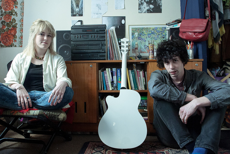
We are a Galway based band called It Was All A Bit Black & White. We have together since the begining of 2011. We are a two piece experimental band that make music based on loop stations primarily. Matt Sutton (me) on guitars/synth and Mosey Byrne on drums. We started jamming when we met in art college four years ago.
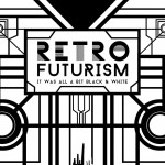
Why are you called ‘It Was All A Bit Black & White’ and how did it come about?
There is 2 answers to this. The name of the band came from the idea of the music we wanted to create together. Saying “It was all a bit black & white” to us was a very bold statement we created that was commenting on the whole music world, the traditional structures and most of all chart music and its necessity to have a sellable voice. Also, a band we really were influenced by at the beginning had a whole lot of youtube videos that where all shot in black and white and it turned out to be really impressionable to us. I think we were describing the video one day and out popped the words “It was all a bit black & white” and then that was that. We thought at one stage to go with Grey Scale but decided against it.
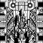
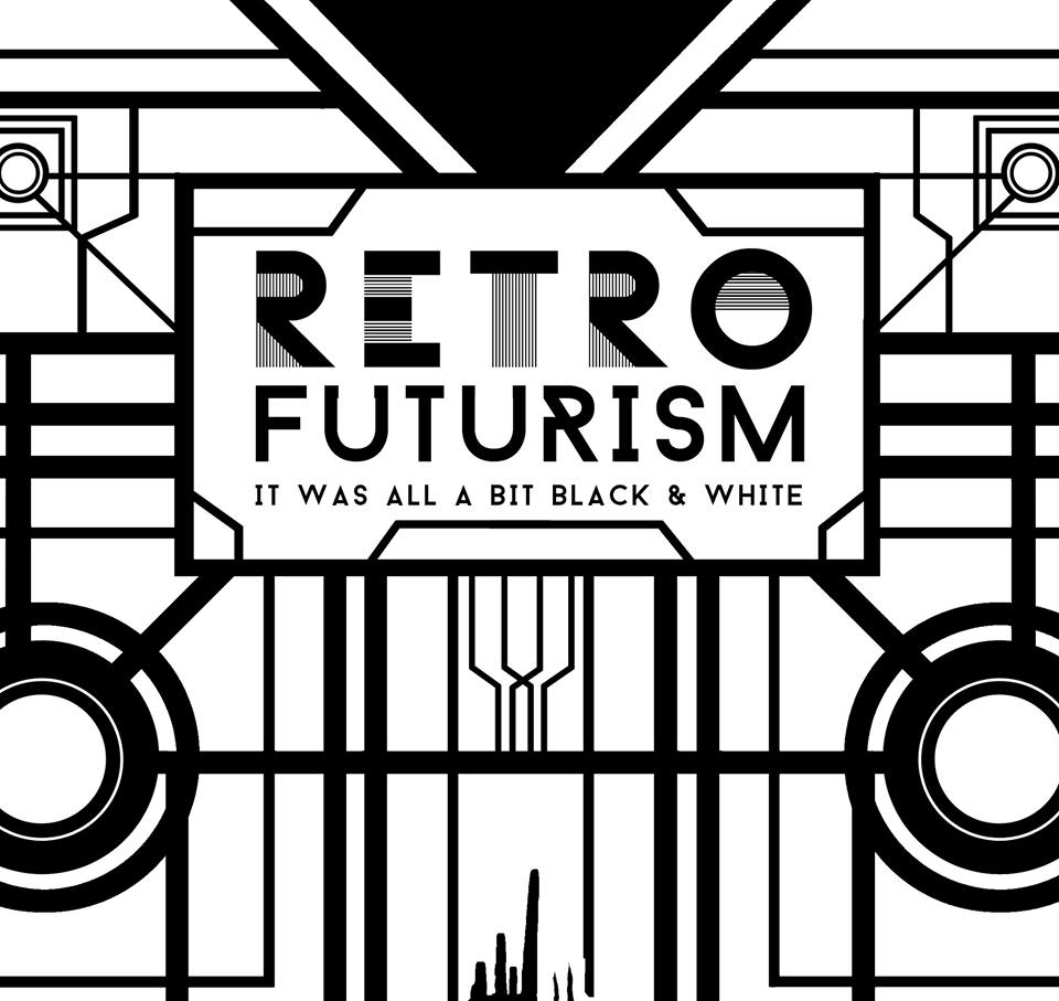
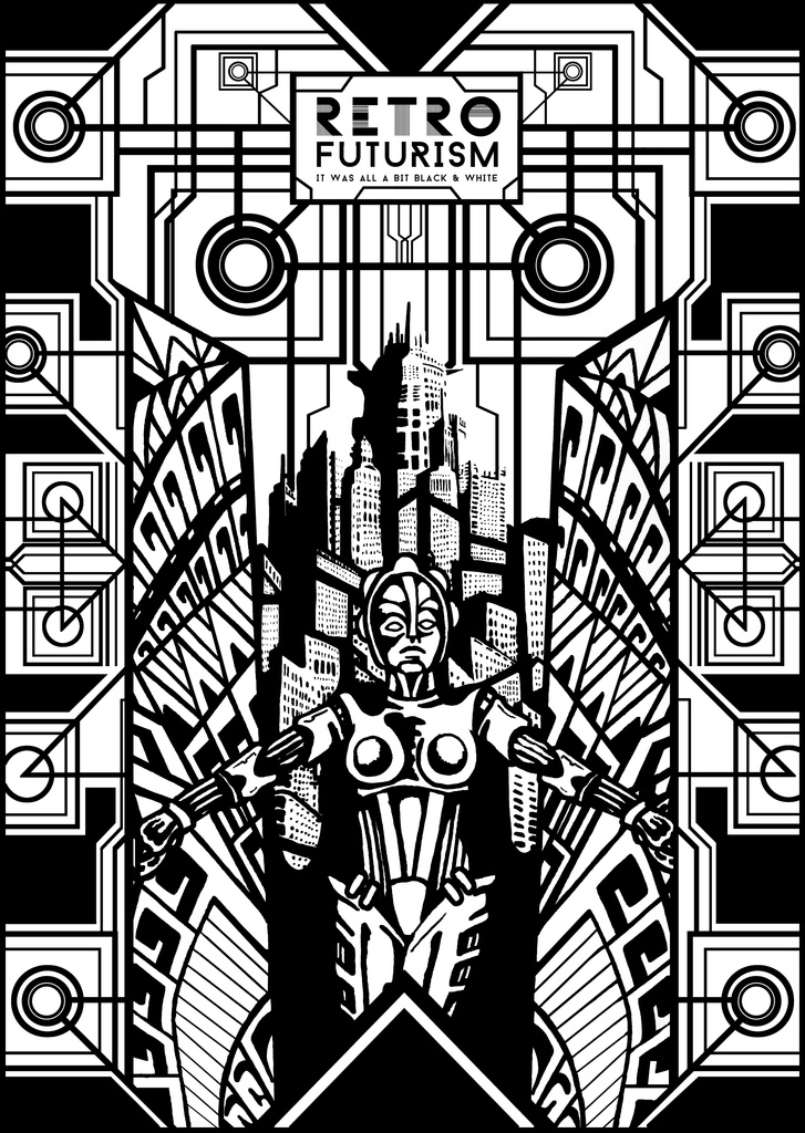
Talk us through the Retro Futurism album cover.
The cover is very heavily influenced by an Art Deco, the Avant-Garde Era and Avant-Garde film. It is filled with lots of geographic deco patterns and its center is a set of doors opening out into this romanticized utopia of a Deco-inspired metropolis with Fritz Lang’s main character, the machine man, opening these doors to welcome you into this world.
What materials did you use to create it?
It started off as a whole lot of drawing that I kept refining again and again. I eventually took the drawing to the my friend David Herlihy who had done all the artwork for our last EP. He is an amazing graphic designer and I brought it to him to piece all the little bits together.
Can you describe the process?
We done loads of changes to the design as we were not happy with the appearance. Originally it had this really flowing art nouveau border that as much as we wanted to keep it just didn’t work so Dave and I worked on some ideas with a simple deco pattern and added a lot of juxtaposing. Eventually we came out with what we have now.
What inspired the artwork for this particular record?
Fritz Lang’s Metropolis. It’s full of deco imagery – it’s amazing. The title Retro Futurism again came out of us friends sitting around watching movies etc. The original Total Recall with Arnie was on TV and it was so futuristic but there was one scene where Arnie was controlling this really high tech stuff through the use of an old Apple Machintosh. The term retro future was thrown out which evolved into retro futurism.
Do you feel your art relates to the music?
Yeah, I hope so, at least that was the idea. We use the term experimental to describe our band anytime someone asks us what type of genre we are. I think we use this because there is a relation to the term “avant-garde”. Not to bore anyone with art history lessons but the movement happened in the early 1900s. The term avant-garde refers to a pushing of the boundaries of what is accepted as the “norm” of its time. So that being said we wanted to make an image that related back to the avant-garde movement and Metropolis seemed to be the strongest candidate to display this idea.
Who are your favourite artists and your biggest influences?
That’s a hard one. I’m going keep it in the album art/music genre. I really love the How to Destroy Angels’ art work and music that was dropped this year. I think all of the artwork was done by Rob Sheridan, who has been heavily involved with Trent Reznor’s projects for years. I also really love M & E designs too! Everything they put out blows my mind, from posters, albums, the Redneck Manifesto and Jape stuff and even the corporate stuff its all just fantastic.
Are there any album covers you’d love to recreate in your own style?
My buddy Ray from Wingnut Records, who is putting out this record, showed me a beautiful early Pixies vinyl with a very obscure, eerie photo on it that I thought was just fantastic. Maybe something like this could be cool. Something that makes your skin crawl!
What’s your personal favourite album cover?
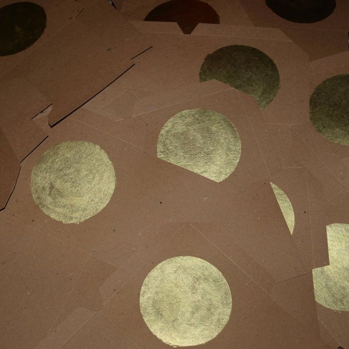
I think the last Laura Sheeran album that was dropped was great. The CD case was just a cardboard sleeve that she handpainted each cover with a golden circle in the middle. Minimal and genius!
Are there any bands/artists you’d like to create art for?
I’d really love to do something for Anyone. Hint hint.